Interactive dashboard · Chicago
Explore racial boundaries and travel communities.
Switch between racial boundary strength and population shares, overlay travel-community outlines, and select a community to see its constituent block groups.
Open the Chicago dashboardReading the map
Compare two different kinds of boundaries.
Boundary colors run from pale yellow for weaker boundaries to purple for stronger ones. Black outlines show communities in the travel network.
The measurement
Locate sharp changes between populations.
The map uses opposing population-density gradients to locate boundaries between racial groups, accounting for both their strength and direction.
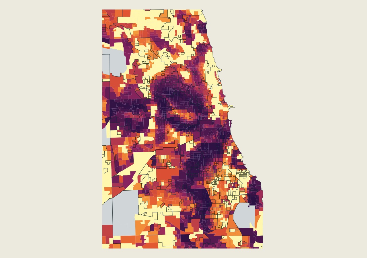
Color ranks the strongest racial boundary at each block group: pale yellow indicates weaker boundaries and purple indicates stronger ones. Black outlines show travel communities.
Open full-size figure