Travel networks
Find travel communities and estimate how often their boundaries recur.
I converted 95.4 million mobile-location observations into travel networks for 100 U.S. commuting zones. Census block groups form the nodes; observed travel supplies the connections. I used the Leiden algorithm to identify groups with denser travel within them than between them.
I generated 100 partitions of each network. For each partition, a block group lies on a boundary if at least one neighboring polygon belongs to another community. Its boundary frequency is the proportion of partitions in which this occurs.
Boundary frequency and community size
bᵢ = (1 / 100) ∑ᵣ I(any neighbor of i belongs to another community in run r)I tune the resolution toward a median community size of 50 block groups, with a maximum of 100 block groups per community and a merge step for small communities. When the target is infeasible, the tuning procedure selects the closest available result. I also compare size targets of 30 and 100 and a shorter optimization run.
Repeated partitions describe stability on the observed travel network.
Racial gradients
Estimate how racial composition changes across space.
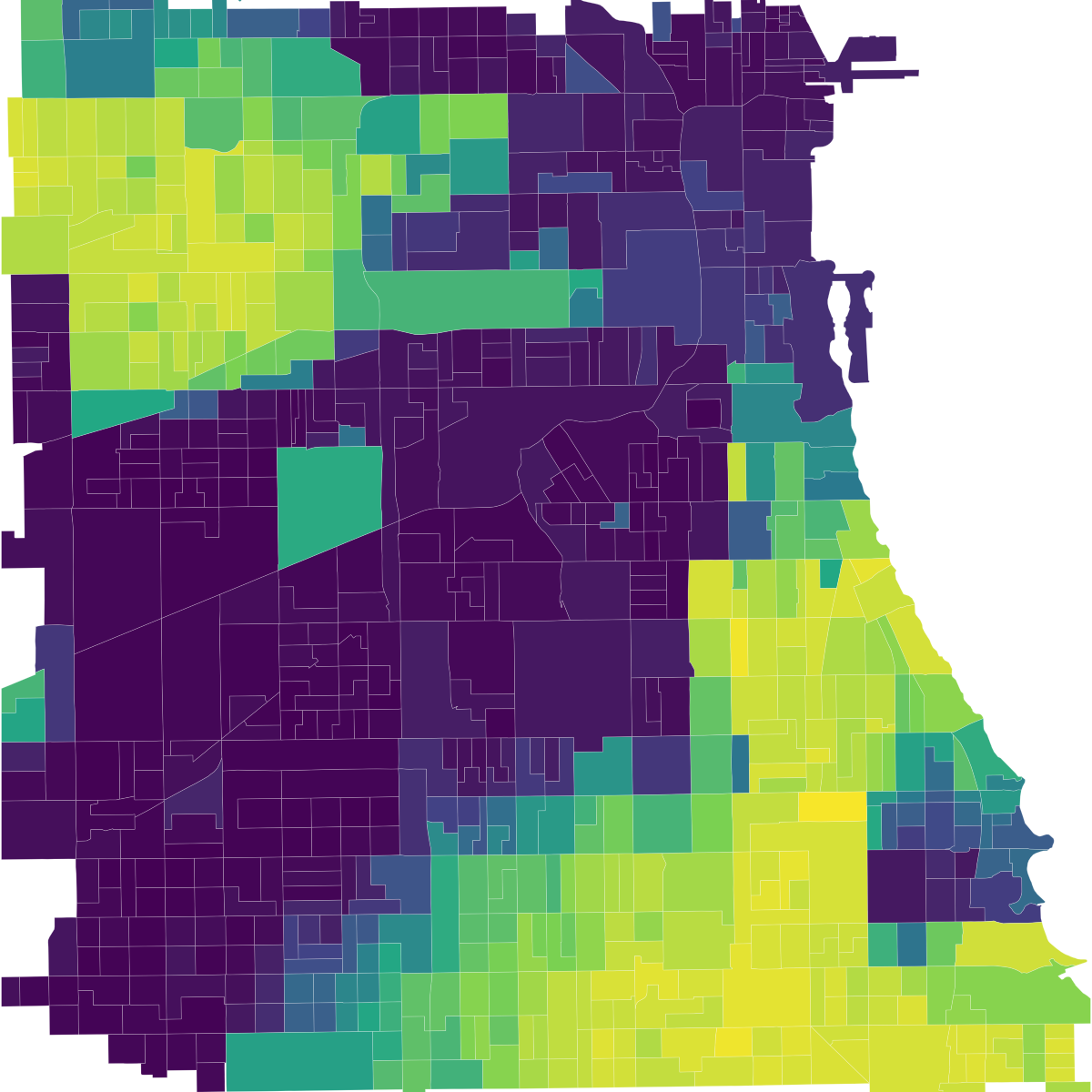
I fit a local regression for each racial group around each block group, giving nearby places more weight. The two spatial coefficients describe how that group’s share of the local population changes toward the east and north. Together, they form a gradient: it points toward the steepest increase in that group’s population share, and its magnitude measures the rate of increase in percentage points per kilometer.
Black population share
Black racial gradient
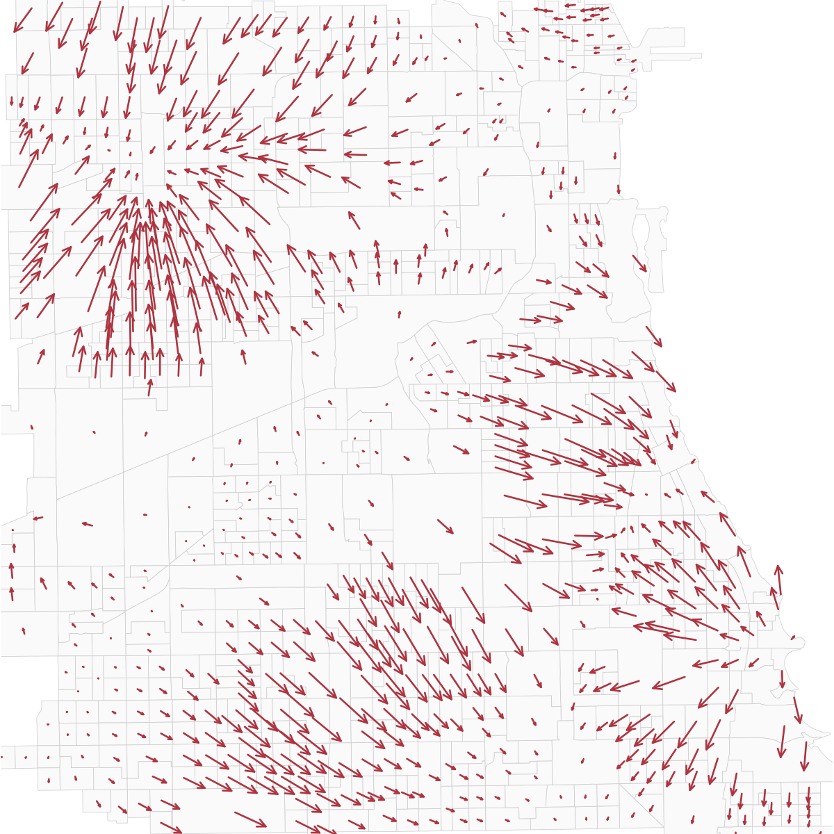
Gradients and spatial weighting
pₘ(x, y) ≈ αₘ + βₓ,ₘ x + βᵧ,ₘ y∇pₘ = (βₓ,ₘ, βᵧ,ₘ)‖∇pₘ‖ = √(βₓ,ₘ² + βᵧ,ₘ²)G = ∑ₘ ‖∇pₘ‖Here pₘ is group m’s population share in percentage points, and x and y are local distances in kilometers. G adds the magnitudes of the five racial gradients. The Gaussian kernel uses σ = 1 km for the regression predictors and Chicago arrows, and σ = 0.5 km for the NYC map. The Chicago maps use the Census category non-Hispanic Black alone. Candidate neighbors come from the national population surface within 10 km.
The map displays G as a percentile among NYC block groups with estimates: 100 × (rank − 1) / (n − 1), using the lower rank for ties. The 90th percentile means a gradient as large as or larger than roughly 90% of NYC estimates. This rescales the map colors; the models use the underlying gradient values.
I also fit density-gradient models, which describe changes in people per unit area. Racial gradients describe changes in population shares.
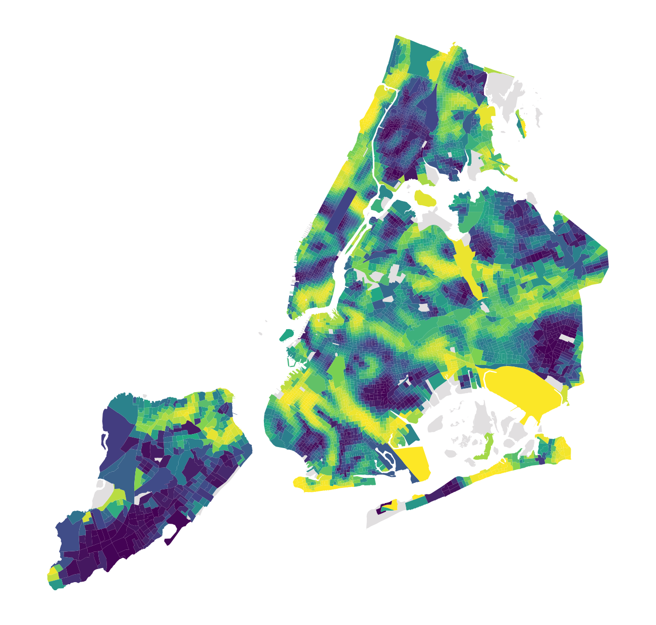
Percentile within New York City
Colors rank the combined racial-composition gradient among NYC block groups with an estimate. Yellow indicates the sharpest local changes. Source: 2020 Census; my calculations.
Open full-size figureStatistical modeling
Model the relationship between racial gradients and travel boundaries.
I fit fractional logits separately for 100 U.S. commuting zones, relating racial gradients to travel-boundary frequency across 138,940 block groups. I estimate standard errors with a Wendland kernel to account for spatial autocorrelation.
Results and checks
Sharper racial gradients often coincide with recurring mobility boundaries.
Sharper changes in racial composition are associated with more frequent mobility boundaries in 52 of 100 commuting zones. Black and Asian racial gradients each show this association in 46 commuting zones.
Model checks
I checked gradient and covariance calculations against independent implementations, recomputed boundary counts from saved memberships, and compared community sizes, sample coverage, and model specifications.